Last Updated: April 2023
Note:
- This App is installed by default under all of our latest plans. The inclusions and differences are described below.
- If you are on a custom Enterprise plan, please speak to your Coviu account representative about having this App configured on your account.
- Not sure what plan you are on? Click here to learn more.
- To create your own custom forms, you have to be the Coviu account Owner or Administrator.
- If you have created your own forms and would like to learn more about how to use them in a consultation, please click here.
On this page:
- How many custom forms can you create and publish?
- How to start creating your custom forms
- Field components
- Field validations
- Formatting components
- How to manage your custom forms
- How to use your custom forms
- More support sessions
How many custom forms can you create and publish?
As an Owner or Administrator of your Coviu account, you can create as many custom forms as you wish. However, you will need to publish your custom forms to be able to use them in your video consultations and there are limits when it comes to how many forms you can publish. The limit depends on what plan you have signed up for; below is a breakdown of the inclusions and differences across our latest plans:
| Essentials | Standard | Premium | Enterprise |
| 1 published form per account | 5 published forms included per account | 10 published forms included per account | Account dependent |
| $5 AUD per month, per additional published form, or $50 AUD per year |
Administrators will need to speak to their Coviu account manager to get this feature enabled for their clinics
|
||
If you are not sure what plan you are on, you can click here to learn more.
The number of published forms included on your account pertains to those forms that are in use, meaning you still have the ability to have other unpublished forms that are not in use. You can publish and unpublish forms as you wish if your limit has been reached. Alternatively, you can click here to learn how to upgrade your account to receive access to more forms and other features.
How to start creating your custom forms
- Log in to your Coviu account as per usual.
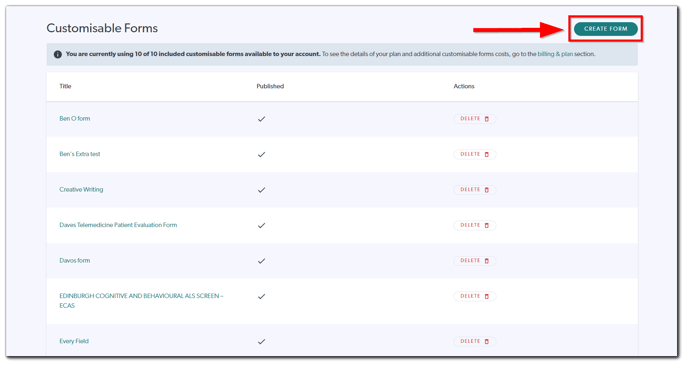
- Scroll down on the left side menu of the Dashboard and click Customisable Forms (if you can't see the Customisable Forms button, then you are not the account Administrator).
- Click Create Form.
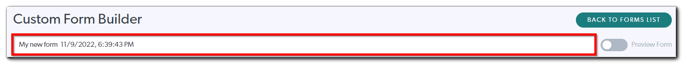
- A new blank form will be created with a system-generated name. You can rename the form by editing the name field.
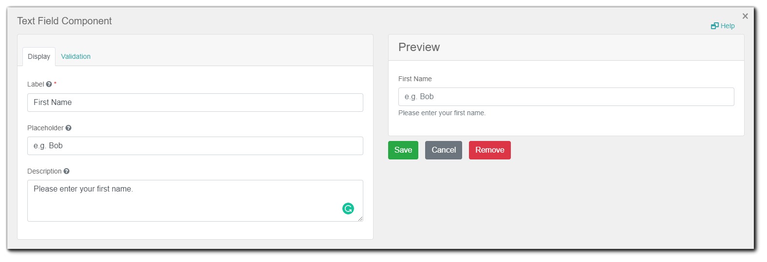
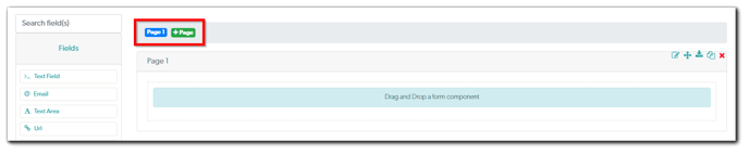
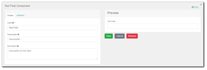
- Click Fields or Formatting, and simply drag and drop the components that you wish to include in your form from left to right, underneath the 'Drag and Drop a form component' label.
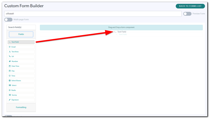
- You will be prompted to configure how the component will look or be displayed in your form. You can hover your mouse pointer on the '?' symbol to learn more about the setting and use the Preview panel to the right to help you configure the component. Click Save to insert the component in your form.
- You can manage components using the four buttons that appear above each component that is already placed in the form. From left to right:
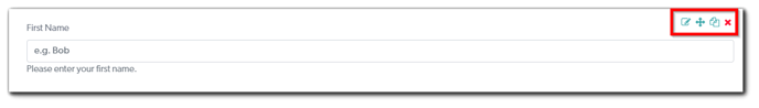
- Edit: This allows you to go back to the configuration settings panel of the component (as shown in the previous step) and manage the settings.
- Move: Click and hold this button to move your component around to adjust its positioning in your form. Alternatively, you can also click and hold the component itself beside its label and do the same.
- Copy: This allows you to copy the component with all its configuration settings and paste it below other components. After clicking this button, the Paste below button should appear to the left of this button, above all of the components in the form. Click the Paste below button to paste the copied component below that particular component. Furthermore, you can then use the Move button to adjust its positioning.
- Remove: Click this button to remove the component from your form.
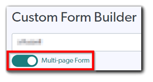
- If you wish to make your form a multi-page form or add additional pages to your form, you can toggle the Multi-page Form button to the 'on' position (the button will turn green). You can then add more pages to your form by clicking +Page above the form editor.
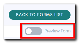
- Throughout the creation of your form, you can always toggle the Preview Form button to the 'on' position to view what your form will look like when it is being used in a consultation (i.e. the published version).
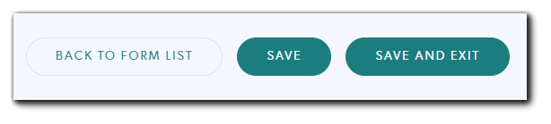
- Once you are finished creating your form, ensure that you scroll down and click Save (if you want to stay on the same screen) or Save And Exit (if you want to go back to the form list after saving your form) to save your form. Clicking Back To Form List will not save your form.
- You will need to publish your form in order to use the form in your consultations. To do this, scroll down and toggle the Publish Form button to the 'on' position. The limit on how many forms you can publish is shown above the form list; more information regarding this is available here.
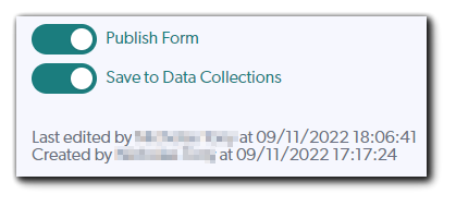
- To allow your form to be saved in your Data Collections after using it in your consultations, toggle the Save to Data Collections button to the 'on' position as well.
Field components
Text Field
A Text Field can be used for short and general text input (e.g. first name, last name, etc.)
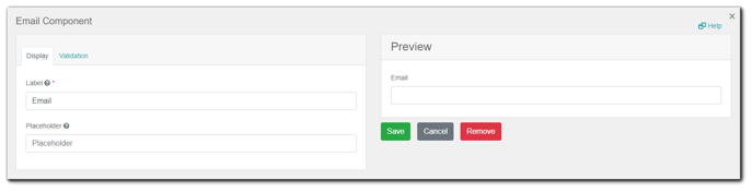
The Email component is nearly identical to the Text Field component. This component already has validation settings configured that ensure the value entered is a valid email address. Use this component when you want an email address field for your form.
Text Area
A Text Area has the same options as the Text Field form component. The difference is that it will be a multi-line input field that allows for longer text (e.g. a comment field, etc.)
URL
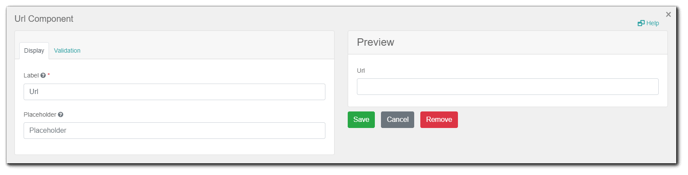
The URL component is nearly identical to the Text Field component. This component already has validation settings configured that ensure the value entered is a valid web address or link.
Number
Number fields can be used whenever a field should be limited to a type of numerical value (e.g. ID number, age, etc.)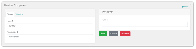
Date Time
Date Time form components can be used to input dates, times or both dates and times.
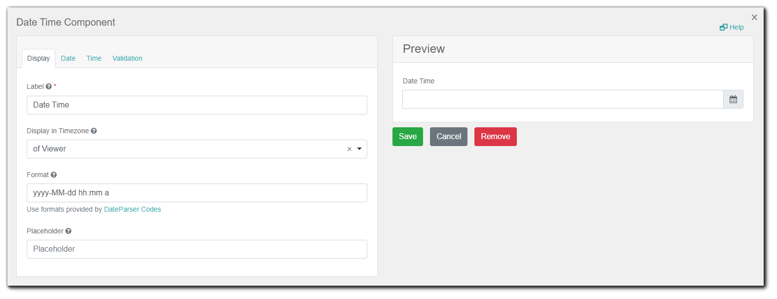
Date settings: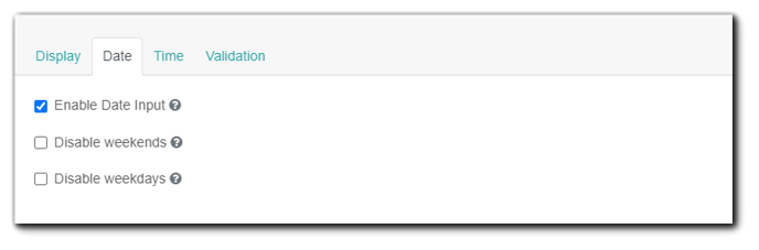
-
Enable Date Input: If this is checked, dates can be entered for this field.
- Disable weekends: Check this to disable weekends.
- Disable weekdays: Check this to disable weekdays.
Time settings: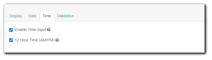
- Enable Time Input: Allow entering a time as part of this field.
- 12 Hour Time (AM/PM): If checked, time will be displayed in 12-hour (AM/PM) time. If not checked, it will appear in 24 hour time.
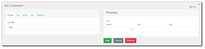
Day
The Day component can be used to enter values for the day, month, and year using a number or select type of field.
Day settings:
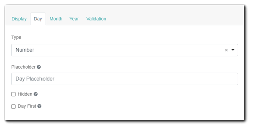
- Type: The type of input can be selected between Number or Select types.
- Placeholder: The placeholder text that will appear when the Day field is empty.
- Hidden: Hide the Day part of the component.
- Day First: Display the Day field before the Month field.
Month settings: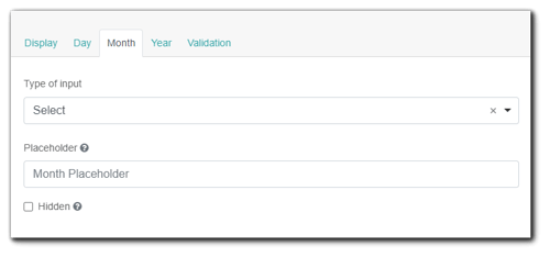
- Type of input: The type of input can be selected between Number or Select types.
- Placeholder: The placeholder text that will appear when the Month field is empty.
- Hidden: Hide the Month part of the component.
Year settings:
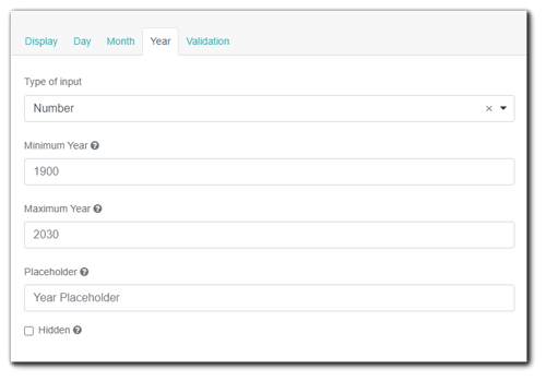
- Type of input: The type of input can be selected between Number or Select types.
- Maximum Year: The minimum year that can be entered.
- Maximum Year: The maximum year that can be entered.
- Placeholder: The placeholder text that will appear when the Year field is empty.
- Hidden: Hide the Month part of the component.
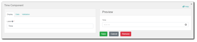
Time
The Time component can be used to input time.
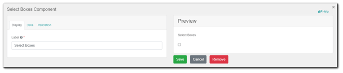
Select Boxes
The Select Boxes allow the user to check multiple values from a list of options.
Data settings:
- Default Value: After entering your different Values, select the values that you wish to be selected by default before user interaction.
- Values: These are the values that will be selectable in this field. The Value column is what will be stored in the form data upon submission and the Label column is what is shown to the users. The Value column will be filled automatically when you enter something in the Label column.
- Shortcut: Please ignore this setting.
Select
The Select component displays a list of values in a dropdown list to users. Users can select one of the values.

Data settings:
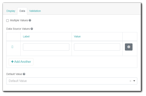
- Multiple Values: Allows multiple values to be selected for this field.
- Data Source Values: These are the values that will be selectable in this field. The Value column is what will be stored in the form data upon submission and the Label is what is shown to the users. The Value column will be filled automatically when you enter something in the Label column.
- Default Value: After entering your different Data Source Values, select the values that you wish to be selected by default before user interaction.
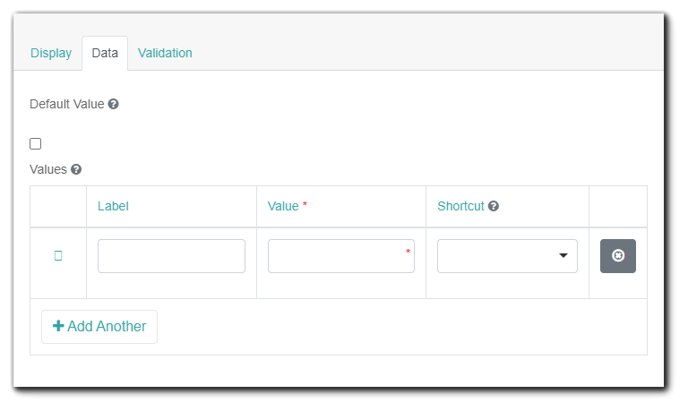
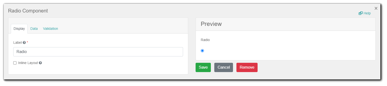
Radio
The Radio component allows the user to check only one value from a list of options.
Data settings:
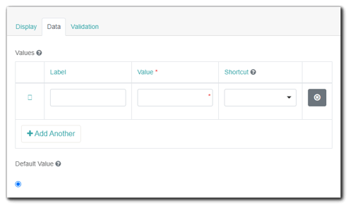
- Values: These are the values that will be selectable in this field. The Value column is what will be stored in the form data upon submission and the Label is what is shown to the users. The Value column will be filled automatically when you enter something in the Label column.
- Shortcut: Please ignore this setting.
- Default Value: After entering your different Values, select the values that you wish to be selected by default before user interaction.
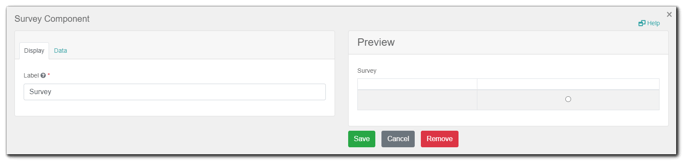
Survey
The Survey component works similarly to the Radio component. Instead of one question, users are able to select a value for multiple questions which are configured within the component settings. This is a great component to utilize when asking multiple questions with the same context of answers or values.
Data settings:
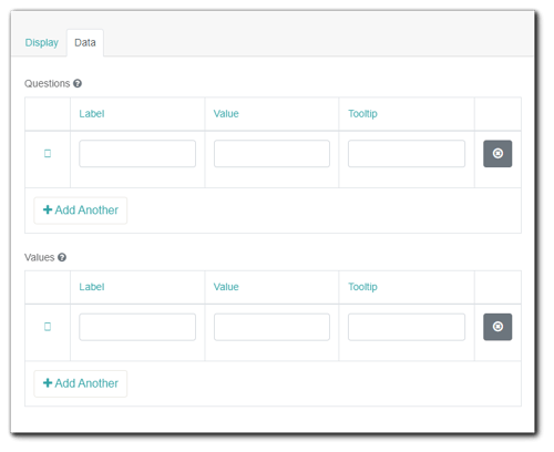
- Questions: The questions you would like to ask within the survey. The Value column is what will be stored in the form data upon submission and the Label is what is shown to the users. The Value column will be filled automatically when you enter something in the Label column. The Tooltip can be used to provide more information regarding the question by having a '?' symbol beside the question that you can hover your mouse pointer on.
- Values: The values that can be selected per question (e.g. ‘Satisfied’, ‘Very Satisfied’, etc.) The Value column is what will be stored in the form data upon submission and the Label is what is shown to the users. The Value column will be filled automatically when you enter something in the Label column. The Tooltip can be used to provide more information regarding the answer by having a '?' symbol above the answer that you can hover your mouse pointer on.
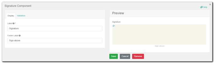
Signature
Field validations
You can apply or enable validations for most field components when you are configuring them. If you see the Validation tab for the field component you are adding to your form, this means that it is possible to configure validations for that field component. Below are the validation options available (note: some field components will not have all of them):
- Validate On: When values are being entered in the field, the system will validate the values either on Change (i.e. when typing in real-time) or Blur (i.e. when clicking away from the field).
- Required: A required field must be filled in before the form can be submitted.
- Minimum Length: The minimum length requirement this field must meet.
- Maximum Length: The maximum length requirement this field must meet.
- Custom Error Message: The error message displayed if the entered values in the field do not meet the validation requirements.
- Minimum checked number: The minimum checkboxes that must be selected before the form can be submitted. Only available for the Select Boxes field component.
- Maximum checked number: The minimum checkboxes that must be selected before the form can be submitted. Only available for the Select Boxes field component.
Formatting components
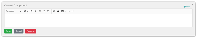
Content
A Content component may be added to a form to provide non-field information. For example, if you need instructions at the top of your form that is for display only, or to add an image or logo to your form, you can use this component.
Columns
This component can be used for grouping other field components (such as the Text Field, Text Area, Select Boxes, etc.) into configurable columns. It might be useful if you want to display more than one component in one line.
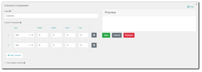
- Column Properties: Here you can configure a number of columns that will be displayed in a form and specify the Size, Width, Offset, Push and Pull settings for each column. When configured, you can easily rearrange the columns using the drag-and-drop feature without a need to make everything from scratch. To make it simple, you can just focus on the Width setting here. The maximum width of the form is 12. So, you can have multiple columns with widths that add up to 12. For example, you can have 2 columns with a width of 6 each, or you can have 3 columns with a width of 4 each, or you can have 4 columns with a width of 3 each, and so on.
- Auto Adjust Columns: If all of the nested components inside one of the columns are hidden, all the positions of the other columns will be adjusted.
Panel
A Panel is used to wrap groups of fields with a title and styling.
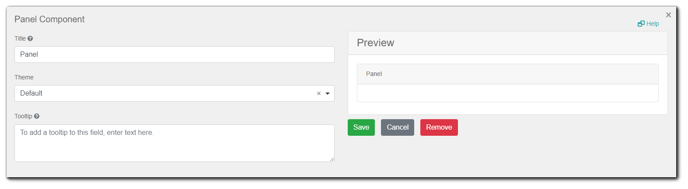
- Title: A title that will be displayed at the top of the Panel.
- Theme: The theming of the Panel.
- Tooltip: This can be used to provide more information regarding the Panel by having a '?' symbol beside its Title that you can hover your mouse pointer on.
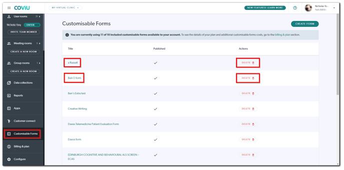
How to manage your custom forms
-
Log in to your Coviu account as per usual.
-
Scroll down on the left side menu of the Dashboard and click Customisable Forms (if you can't see the Customisable Forms button, then you are not the account Administrator).
- To edit any of your forms, click the name of the form. To delete any of your forms, click Delete to the right of the form that you wish to delete.
How to use your custom forms
If you have created your own forms and would like to learn more about how to use them in a consultation, please click here.
More support sessions
You have completed another Coviu help article. You now know how to create your own forms on Coviu.
If this is not what you were looking for, explore our knowledge base and search for another article from here.
If you still require any assistance, please do not hesitate to get in touch with our friendly Customer Success team using any of the contact methods available here.